
I just finished reading Chapter 4 of Argument in the Real World by Kristen Hawley Turner and Troy Hicks. In this chapter, the authors discuss using infographics as a form of argument. Abilock and Williams (2014) define an infographic as “a claim expressed through visual metaphor, conveying the creator’s fresh understanding of relationships, expressed through a judicious selection and arrangement of visuals, evidence, and text acquired during inquiry research within a discipline” (p. 47). Infographics are a powerful tool for making arguments and worth teaching students how to use (Turner & Hicks, 2017).
Infographics are very effective at presenting information quickly and efficiently by leveraging brain science. NeoMam Studios (n.d.) has a site, 13 Reasons Why Your Brain Craves Infographics, illustrating why infographics can be so helpful.
Common Themes in Infographics
In their examination of infographics, Hawley and Turner (2017) identified three universal themes when it comes to infographics. First, the data in the infographic must tell a story. Second, the data must come from reliable sources. Finally, the infographic should be visually appealing and easy to share.
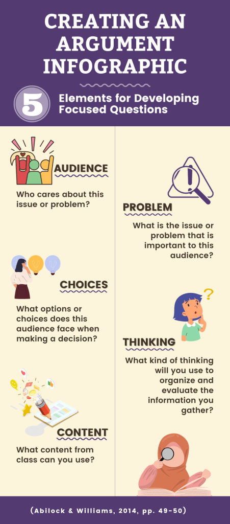
Good argument infographics start with inquiry. Students’ inquiry begins with questions. Students might typically start with the K-W-L strategy to formulate questions (Ogle, 1986) to orient their inquiry. Abilock and Williams (2014) argue that this is not enough. To be relevant, students must consider the infographic’s audience and purpose. Abilock and Williams propose five elements that students’ questions should address. Those are outlined in the infographic to the right.
Application in the Math Classroom
Hawley and Turner (2017) share the following suggestion as a possible classroom activity using infographics. “Identify a local issue of importance to the school or community. Design a survey and distribute it through social media. Using the data that is collected, have students take a stand and create infographics to share” (p. 80). This type of activity could be used to address the Alabama Content Standards for Mathematics. Under the Data Analysis, Statistics, and Probability content area, one of the focus areas states that “data arise from a context and come in two types: quantitative (continuous or discrete) and categorical. Technology can be used to “clean” and organize data, including very large data sets, into a useful and manageable structure–a first step in any analysis of data” (Alabama State Department of Education, 2019, p. 136).
I could see this being used with an issue my school is looking into this year. We are considering revising our bell schedules for the 2024-2025 school year. Many students would like the opportunity to take more electives than they currently do. Teachers would like to see some type of study hall built into the school day to assist students who need extra help. This provides an excellent real-world scenario of where mathematics can be applied to help answer questions. We could involve students in this real-world problem. Students could help design a Google Form to collect the preferences of students, teachers, and parents. After collecting the information, students could analyze and organize the data by creating infographics to help share the collected data with all stakeholders in our school community. Each grade level could analyze their data and the school as a whole.
References
Abilock, D., & Williams, C. (2014). Recipe for an Infographic. Knowledge Quest, 43(2), 46–55.
Alabama State Department of Education. (2019). 2019 Alabama course of study: Mathematics.
Ogle, D. M. (1986). K-W-L: A teaching model that develops active reading of expository text. Reading Teacher, 39(6), 564–570.
Turner, K. H., & Hicks, T. (2017). Argument in the real world: Teaching adolescents to read and write digital texts.
Zeevi, D. (2013). What makes a good infographic? [Photograph]. Flickr. https://flic.kr/p/dSxX4V

Kevin, your infographics are great. I believe that allowing our students to utilize images to engage in conversation is a great instructional strategy. Your comment about allowing students to think about the infographic to spark their inquiry is a nice idea to start a lesson. I read in Zhang & Pinto (2021) about allowing students to create the quote to go along with a meme to get students excited and engaged in their learning, and it ties with your thinking as well. Of course, I love that you merge this learning with math because that is your life; that is mine as well!
Zhang, B. & Pinto, J. (2021). Changing the world one meme at a time: the effects of climate change memes of civic engagement intentions. Environmental Engagement, 15(6), 749-764. https://doi.org/10.1080/17524032.2021.1894197
LikeLike